In the world of SaaS, the website builder segment is incredibly competitive.
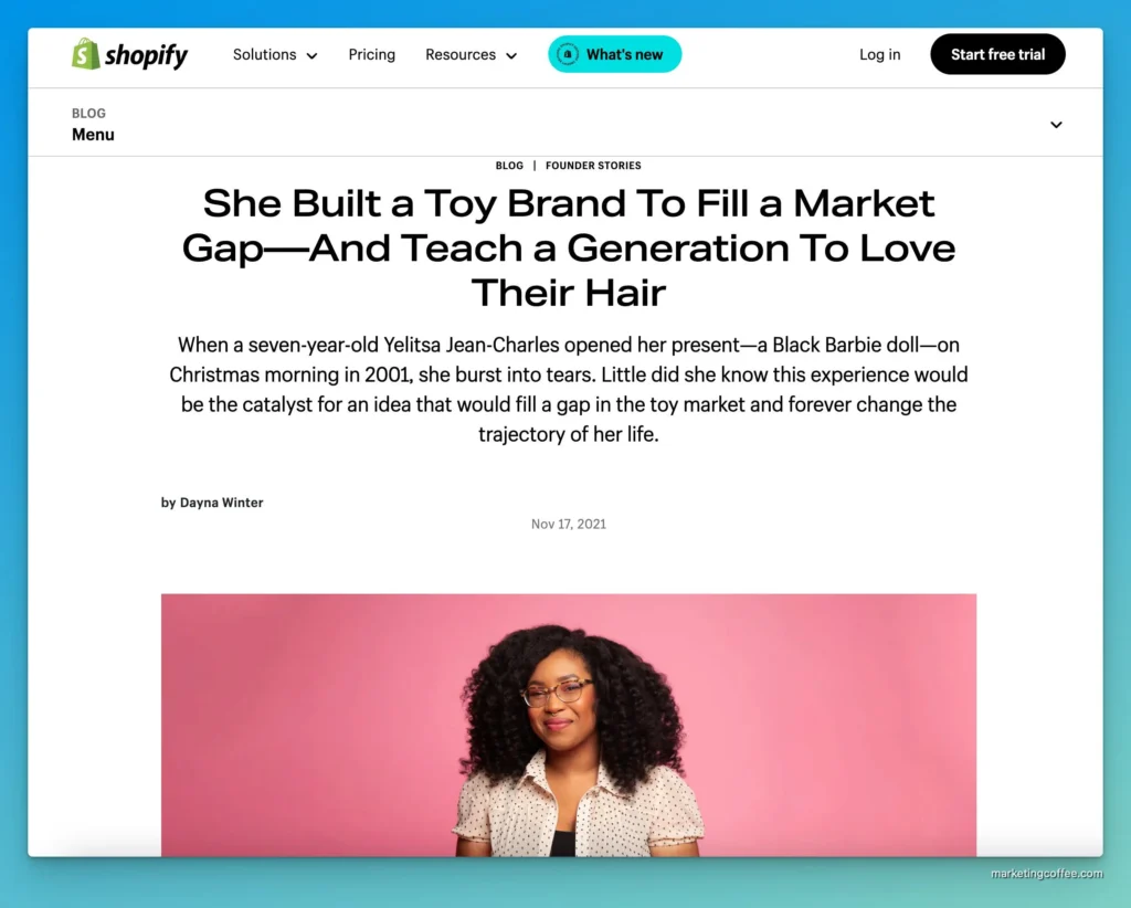
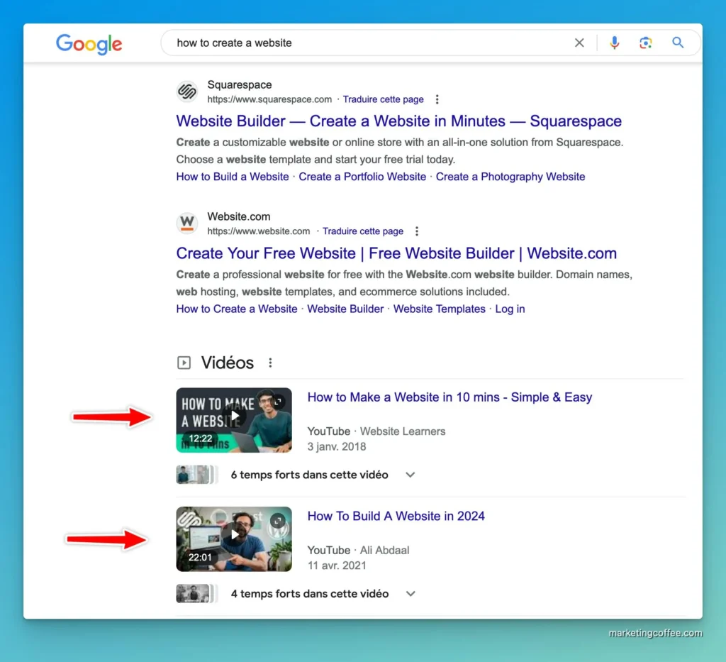
It’s a pretty saturated market with well-established players such as Wix, Shopify, Squarespace, and Webflow, making it hard for newcomers to find and keep their audience.
In such a tense market, user acquisition costs are usually very high, meaning maximizing conversions and quickly turning visitors into users is critical.
About a year and a half ago, a good friend told me to look at Framer, a Webflow competitor.
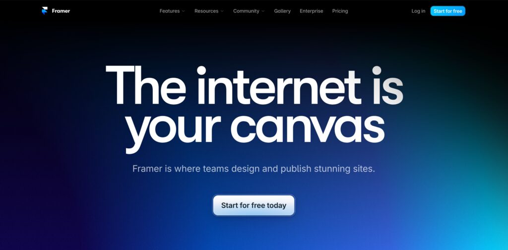
I liked their landing page. It made quick work of convincing me to try it out.
But what truly blew my mind wasn’t the landing page. It was the subsequent onboarding.
In under 5 minutes, I knew how capable Framer was and how different it was from other website builders.
Even better, I could design a convincing copycat of Product Hunt’s landing page without knowing how Framer worked.
Let’s dive into what makes Framer’s onboarding so effective.
Have users converge to a single action
A simple user experience is critical to drive action.
In Framer’s case, users are prompted to start the onboarding immediately.
There’s no side distraction. No « upgrade to paid plan » CTA.
It’s great because it forces users down the onboarding session—no other choice.
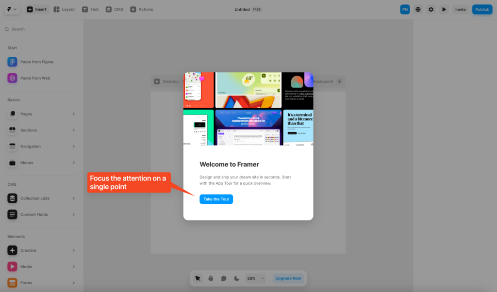
Use a video to capture attention right away
Framer’s onboarding starts with a video.
It works well because users hate seeking information here and there.
They want information delivered straight to them. No fluff.
It works even better because it has a single purpose: to have users download the Framer Chrome extension to copy their website back to Framer (or any website design, for that matter).
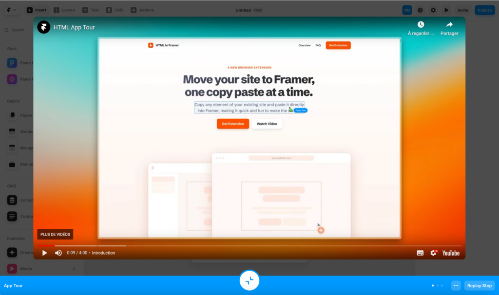
Use social proof during onboarding
No one wants to download a dodgy Chrome extension.
It helps when your product immediately shows tangible social proof :
- Featured in the Chrome extension store
- 60K+ users
- 4.9 star rating
Offer users immediate value
This is the single most crucial hack for a successful SaaS onboarding.
Users want value right away. They want to see how the product works for them.
Don’t make users work for the product. Make the product work for users.
In my case, I found it absurdly easy to copy and paste entire website chunks into Framer.
I could literally design a website right away by copying bits from various places.
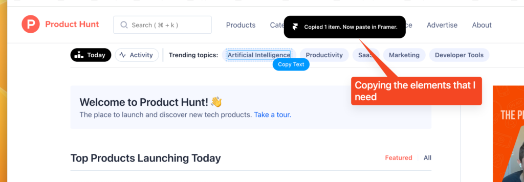
In less than 2 minutes, I had recreated the entire Product Hunt homepage on Framer.
Talk about a powerful design tool.
I was sold.
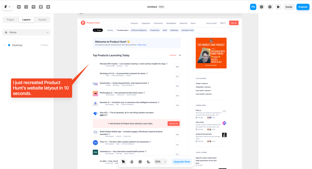
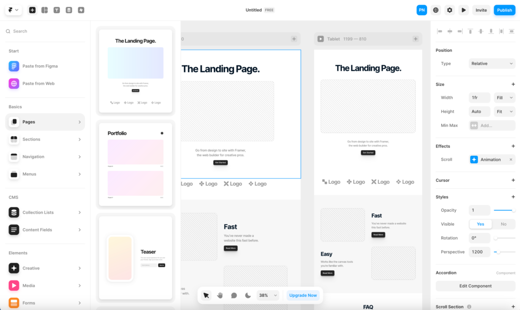
My Framer interface looked like this after a few minutes spent copying the producthunt.com website.
Give users a clear path after onboarding
Framer’s onboarding is excellent. In fact, I think it’s best-in-class.
However, a critical part of their onboarding success is that users know what to do when it’s over.
Make it stupid-simple to know what users should do after onboarding.
In my case, I started a landing page design.
That’s it for today. If you found this interesting, consider subscribing to my newsletter.
It’s free – and I will send you 3 new marketing hacks you can use immediately every week.
